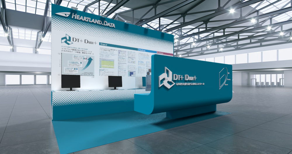
DX時代を勝ち抜くためのテストツールDT+のVI開発とローンチブースのデザイン
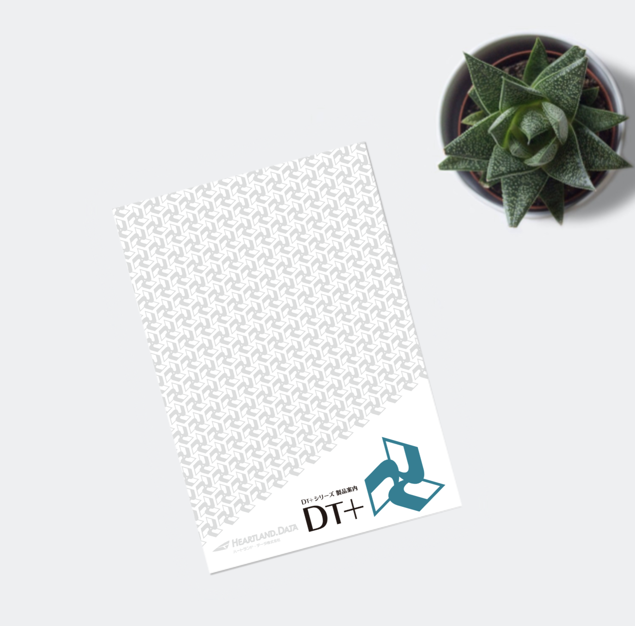
IoTや組込みソフトウェアの動的テストツールとして業界をリードしてきたDT10の後継機として生まれ変わったDT+(ディティープラス)。さまざまなデータ収集を可能にするDBOX+ハードウェアと、それらのデータを連動させ効率的に解析するDT+アプリケーションで構成された新しい動的テストツールである。本プロジェクトではVIとしてロゴマーク、ロゴタイプ、各種アイコン、カタログ、モノグラムパターンと、展示会へ出展するローンチブース3件をデザイン開発した。このDT+のプロダクトコンセプトは、DX(デジタルトランスフォーメーション)、Diversity(多様性)、Dynamic(動的)である。
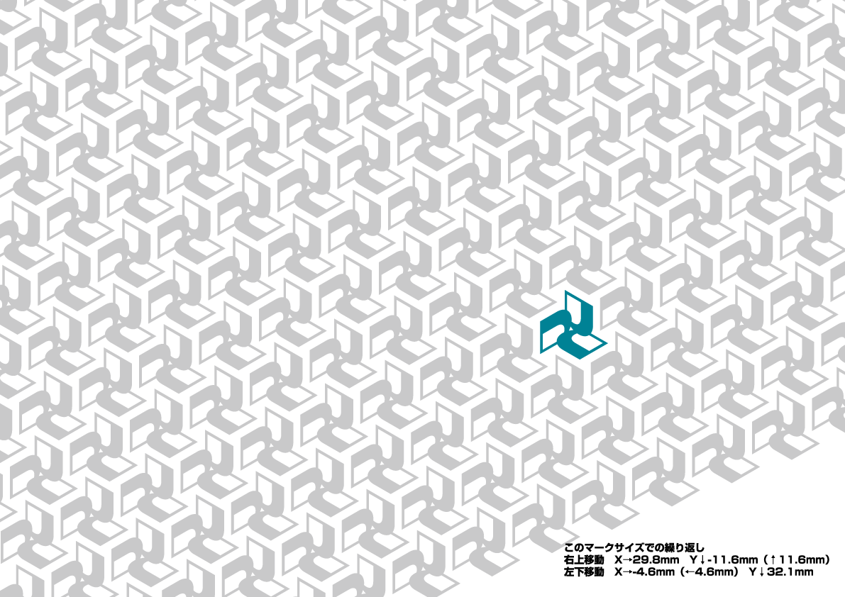
ロゴマークは、ブランド・コア「3つのD」を、3D(Dimension)と捉えた。3つの Dimension=軸、座標は、空間や立体、世界すべてを形作る基本となる。 3つの D がモノ作りの基本であることを表現している。そこに、さまざまなアプリケーションやハードウェアが組み合わせて使うツールの特徴と、動的を表す「回転」コンセプトを合体させ風車マークを作った。そこにタイポグラフィーとして70年代に新風を吹き込み革新を起こした書体「Typos」を使い、DT+の革新性を準えた。
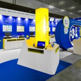
ブースデザインは、他社との差別化を前提に多様性を感じるDTグリーンを開発、ロゴマークだけでなくブース全体のキーカラーとしてフィーチャーした。ダイナミックで躍動感のある造形を目指し、コンパクトながらも他社に埋没しないオリジナリティの確立に注力した。
デザインディレクション _ Designcafe 平澤 太
ブースデザイン _ Designcafe 平澤 太
グラフィックデザイン _ White Space 望月ミサ
プロダクトディレクション_ EXSTRADREI 山中亮介
プロダクション _ Designcafe / EXSTRADREI
プロデュース _ Heartland Data 賣野高弘/白坂愛衣
クライアント _ Heartland Data
カテゴリー _ VI開発、ロゴデザイン、展示会ブースデザイン・イベント
VI development and launch booth design for DT+, a dynamic testing tool for winning in the DX era.
DT+ is the successor to DT10, the industry’s leading dynamic test tool for IoT and embedded software. It is a new dynamic test tool consisting of the DBOX+ hardware, which enables the collection of a wide range of data, and the DT+ application, which links and analyzes this data efficiently. For this project, we designed and developed a logo, logotype, icons, catalogues, monogram patterns and three launch booths for the exhibition. The product concept of DT+ is DX (Digital Transformation), Diversity and Dynamic.
The logo represents the brand core “3 D’s” as 3D (Dimension). 3 Dimension = axis, coordinates, is the basis for shaping space, solidity and the world. The 3 D’s represent the basis of manufacturing. I then combined the features of the tool, which is used in combination with various applications and hardware, and the concept of “rotation”, which represents dynamism, to create the windmill symbol. We used Typos, the typeface that revolutionised typography in the 70’s, as a reference to the innovative nature of DT+.
The booth design was developed in DT green, a colour that gives a sense of diversity and differentiates the company from its competitors, and is featured as the key colour of the entire booth as well as the logo. The aim was to create a dynamic and dynamic shape, compact but with an originality that would not be overshadowed by competitors.

![]()