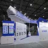
情報セキュリティEXPO2011に出展するMOTEX社の展示会ブース。MOTEX社は、企業利益を創出するセキュリティ対策のアプリケーションを開発販売している。赤黒に色面分割されたドロップペーパーやストレッチフォームによるシャープで軽やかなファブリックは、MOTEX社のイメージであり、複雑に交錯するインフラを可視化した「情報の束」を表現。オブジェクト化されたネットワークラインは、MOTEXレッドに染められ縦横無尽にブース内を駆け巡る。2011年5月11日~13日、東京ビッグサイトにて開催 20小間 185sqm
The design for Motex’s event booth for the Information Security Expo 2011. Motex is a Japanese software developer focusing on security applications, vital for corporate profitability.
The design divides the colors between red and black and features Motex’s coporate color ‘Motex Red’. The drop paper and sharp, light stretch form fabric fits Motex’s sophisticated image perfectly and expresses the ‘bundle of information’ which visualizes the complex blending of security infrastructure. Lightly objectified network lines run freely around the Motex Red colored interior of the booth. The exhibition ran from May 11th-13th 2011 at Tokyo Big Site.
※2012 DSA 空間デザイン賞:入賞
※年鑑日本の空間デザイン2013 掲載
※LIVE POWER 2011 掲載作品(Sendpoint Books / China)
カテゴリー _ 展示会・イベントブース・トレードショー
ロケーション _ 東京都・江東区
クライアント _ エムオーテックス株式会社
エージェンシー _ 株式会社 ケーズスタッフ
アートディレクション・ブースデザイン _ Designcafe-Inc.
プロモーター _ 株式会社YMオフィス
プロダクション _ 株式会社スリーライト
ディレクション _ 株式会社スリーライト
プロダクトディレクション _ 株式会社スリーライト